CENTRE NAME: NORBURY MANOR BEC
CENTRE NUMBER: 14343
CANDIDATE NAME: SHARNA HYLTON
CANDIDATE NUMBER: 9254
UNIT: G324
Wednesday, 25 February 2015
Tuesday, 24 February 2015
Monday, 23 February 2015

Sunday, 22 February 2015
, QUESTIONNAIRE ANALYSIS (4)
ANALYSIS
Film trailer questions
1. How old are you? 17
2. Do you normally watch films from the horror genre? NO
3. What elements did you notice in our trailer that you have seen in others?
BLOOD
SCARY MUSIC
BLOOD
SCARY MUSIC
4. What was the most memorable moment in the trailer in your opinion? THE PRAYER SCENE
5. Did you feel the trailer was scary? NO, IT NEEDED MORE JUMPY PARTS
6. Did you enjoy the trailer? YES, IT WAS STRAIGHT FORWARD
7. What do you think the story was actually about? PICKING UP A CURSED OBJECT - LEADING TO THE GIRL BEING CURSED
8. How would you change this trailer? MORE TRANSITIONING CLIPS AND JUMPY PARTS, DARK SETTING
9. Overall what do you rate our trailer? 3/5
Poster Questions
10. Do you think the poster is realistic? YES
11. What do you like most about it? THE CHAIN ITSELF LINKS TO THE MASTHEAD
Magazine Questions
1. Does the trailer link to the magazine and poster? YES
2. What is effective about the horror magazine? CENTRAL IMAGE
3. What stands out on our magazine the most? CENTRAL IMAGE
4. Do you think that it looks similar to real media texts? YES
, QUESTIONNAIRE ANALYSIS (3)
ANALYSIS
Film trailer questions
1. How old are you? 17
2. Do you normally watch films from the horror genre? YES
3. What elements did you notice in our trailer that you have seen in others?
BLOOD
WEAPONS
RELIGIOUS OBJECTS
SCARY MUSIC
BLOOD
WEAPONS
RELIGIOUS OBJECTS
SCARY MUSIC
4. What was the most memorable moment in the trailer in your opinion?
5. Did you feel the trailer was scary? YES, BECAUSE OF THE WAY THE VILLAIN APPEARED (CREEPILY)
6. Did you enjoy the trailer? YES, BECAUSE IT WAS ABOUT A VILLAIN BEING AWOKEN FROM THE DEAD
7. What do you think the story was actually about? A NECKLACE AWAKENED A GIRL FROM THE DEAD
8. How would you change this trailer? HAVE MORE DIALOGUE
9. Overall what do you rate our trailer? 4/5
Poster Questions
10. Do you think the poster is realistic? YES
11. What do you like most about it? THE TITLE OF THE FONT, THE IMAGE WAS EFFECTIVE
Magazine Questions
1. Does the trailer link to the magazine and poster? YES
2. What is effective about the horror magazine? CENTRAL IMAGE
3. What stands out on our magazine the most? THE VILLAIN
4. Do you think that it looks similar to real media texts? YES
, QUESTIONNAIRE ANALYSIS (2)
ANALYSIS
Film trailer questions
1. How old are you? 18
2. Do you normally watch films from the horror genre? NO
3. What elements did you notice in our trailer that you have
seen in others?
SCARY MUSIC
SCARY MUSIC
4. What was the most memorable moment in the trailer in your
opinion? WHEN THE MAIN CHARACTER PICKED UP THE NECKLACE
5. Did you feel the trailer was scary? NO
6. Did you enjoy the trailer? IT DIDN’T MAKE ME JUMP OUT OF
MY SEAT
7. What do you think the story was actually about? YES, IT
KEPT ME INTERESTED
8. How would you change this trailer? A GIRL WHO TRESPASSED,
AND THEN WAS HAUNTED
9. Overall what do you rate our trailer? 3/5
Poster Questions
10. Do you think the poster is realistic? YES
11. What do you like most about it? VILLAIN’S EYES ‘SCARY
EFFECT’
Magazine Questions
1. Does the trailer link to the magazine and poster? YES
2. What is effective about the horror magazine? CENTRAL IMAGE
3. What stands out on our magazine the most? THE CHAIN
4. Do you think that it looks similar to real media texts? YES
, QUESTIONNAIRE ANALYSIS (1)
ANALYSIS
Film trailer questions
1. How old are you? 18
2. Do you normally watch films from the horror genre? YES
3. What elements did you notice in our trailer that you have
seen in others?
BLOOD
WEAPONS
DARK LIGHTING
RELIGIOUS
OBJECTS
MASKED VILLAINS
SPOOKY SETTINGS
SCARY MUSIC
4. What was the most memorable moment in the trailer in your
opinion? THE PRAYER
5. Did you feel the trailer was scary? NO, THE MUSIC WASN’T
LOUD ENOUGH FOR IT TO BE SCARY
6. Did you enjoy the trailer? YES, THERE WAS AN ELEMENT OF
SUSPENSE
7. What do you think the story was actually about? A
NECKLACE THAT BROUGHT SOME EVIL
8. How would you change this trailer? MAKE THE MUSIC LOUDER
9. Overall what do you rate our trailer? 4/5
Poster Questions
10. Do you think the poster is realistic? YES
11. What do you like most about it? THE PICTURES USE OF
BLOOD
Magazine Questions
1. Does the trailer link to the magazine and poster? YES
2. What is effective about the horror magazine? THE CENTRAL IMAGE
3. What stands out on our magazine the most? THE COLOUR
SCHEME
4. Do you think that it looks similar to real media texts?
YES
Saturday, 21 February 2015
. THE CHAIN OFFICIAL PREMIERE

(left is an example of the invitations we created for the audience)
I created a set of 15 detailed questionnaire's so that we could collect the views of the audience.


Friday, 20 February 2015


Thursday, 19 February 2015

Wednesday, 18 February 2015
. OFFICIAL FILM POSTER IMAGE

When deciding on what the image should be for the film
poster, I did find it relatively difficult because of the amount of pictures
that were taken. Due to the fact there was a variety of images available, I
finally picked ‘IMG_0632’. This image is of a character in our narrative called
Lilith, and in this image she is holding up an antique necklace in front of her
face. The necklace creates a sort of shadow on Lilith’ face which could be
interpreted as horns, this was one of the reasons that I wanted to include the
image on the final film poster because of the harrowing unnatural element of
the image. Horns are normally related closely to wild animals or the devil,
this would then encourage the viewer to connote, and Lilith was an evil
character, with beast like qualities. The use of the necklace was also
important in allowing the audience to identify what the narrative would be
about, and the relationship between the character of Lilith and the necklace
would mean the events of the narrative are not only centred around the necklace
but also that Lilith’s existence is also centred around it also. The image uses
a mid shot of the character of Lilith, this allows us to see the necessary iconography
to interpret that the film will include elements of the sub-genre, Slasher. The
inclusion of her face, allows us to observe the bruises on her face created by
costume make up and the blood splatter on her shirt allow us to interpret she
is in fact a corpse. This image was appropriate for the film poster because it
does not conceal the appearance of the films subject because of the use of the
camera shot and angle. Blood was an important element to be included because it
is identified as iconography of the horror genre, and we wanted the audience to
interpret that the film was a film from the horror genre, but also to ensure
that the film rating was appropriate for the film as a 15 rating does focus on
a good amount of blood and gore. The use of blood and gore allows the audience
to also interpret that there will be elements of the film that will cause some
discomfort because of the negative events that will take place. Dawn's eyes are
piercing, and encourage the audience to pay attention. I asked members of my
group, my peers and also my teacher if they thought this image would be
appropriate for the poster, and all agreed that the use of strong eye contact
from the character Lilith was appropriate.
The shadow from the necklace over Lilith’s
eye/forehead was an element that I originally intended on getting rid of. When
speaking to my peers however they recommended that I keep the shadow, and
create a sort of cross like image over the eye. Therefore I samples colour from
the false bruise underneath Lilith's eye right eye and created an upside down
cross that would add to the iconography of the main image. I did this using the
lasso tool on Photoshop, which was extremely helpful as if I had used the
rectangular tool and created a cross, it would have become the main focus of
the image. I tried to create crosses, using the colours red and black which
have been identified as conventions of the horror genre but my peers argued
that it gave the poster an animated element, and because I didn't want my
poster to look unprofessional I decided to stick with the lasso sampled cross
that I created. Along with the simple lasso tool I had to learn to rotate the
shape, using short cuts on the keyboard which allowed me to execute the cross
perfectly. The use of inverted cross has strong religious links as it shares
close correlation with Peter (one of the 12 disciples, who it is believed that
Peter requested this form of crucifixion as he felt he was unworthy to be
crucified in the same manner that Jesus died. However in recent years the
inverted cross has been used as an anti-Christian symbol. The anti-Christian
ideals link well with the horror genre as usually religion is only shown when
in connection with the devil or possessions. This still relates to the theme of
religion in the genre but also the iconography used to ensure the poster
represents the genre correctly, this particular symbol has been used in ‘The
Omen’, The Devil Inside and Annabelle.
Creating the cross did take a while as I
had to sample the colour of the shadow when creating an extension of that shape
to extend the cross’ length. When placing the cross on the face it was
hard to alter the brightness and exposure so that it wouldn’t be too overbearing. Along with the black background placed behind her, it appears that she is fading in from the darkness. emphasising her dark and evil character.
Tuesday, 17 February 2015

Monday, 16 February 2015
. FLAT PLAN COMPARED WITH OFFICIAL POSTER

As you can see above there is a collage
of the flat plan beside the official poster. I have made several changes to the
flat plan, when creating the poster as I realised a lot of the aspects didn't look as good as they did on the flat plan and with the help of audience research I asked my peers
what they preferred during the creative process. The positioning of the films
title was something that did not change as it is meant to be in line with the
main image so that the audience could view the correlation between the image
and title. The title is the biggest text on the poster because it allows the
audience to identify the films title.With the title being in an unconventional
position, the audience may have viewed my poster as unprofessional. Instead of putting the films title at the bottom of the poster, I chose to move the date of the films release there because it would provide a level of symmetry, with this, it would encourage the audience to pay attention to the important information.
As you can see the colour scheme; red,
black and white is applied here also. With the most important text in red
becoming the focus. The tagline ‘EVIL NEVER DIES’, is written in whit text
which contrast with the red title and the black background. The position of the
tag line has moved, this was because there was a large space that was extremely
empty and I found that the tag line looked better in this area.
I used the same type of text on both the
magazine and poster, and therefore I though it would be helpful to include it when designing the posters' website, tagline and title.
The film rating was moved from the right
bottom corner to the left bottom corner and then I placed the company logos
along the base of the poster. All of the company logos being blocked together
made the poster look more professional because this is a convention of horror
posters.it definitely looks better to have all of the graphics in one space
because of the ability as an audience to then focus on these last as this is a
form of additional information and not the main focus. The layout of the poster
is extremely simplistic, a lot like the flat plan which is something I wanted
to maintain.
The credits have remained in the initial
position, this is a convention of the genre and therefore something I was not
willing to change. If the credits were found anywhere else they would have
looked a if they were inappropriately placed and may have taken away from the
elements of the poster that should have been the main focus.
As you can see the main image of the
character Lilith has remained the main focus of both the flat plan and the
official poster. As you can see the villain is holding the chain in both , this
is because the chain is the driving force for the events in our trailer. With
this being the main focus it would have been foolish not to include it on the
official poster. The chain is an acting
symbol of evil and therefore important in identifying the genre of the film and
therefore can be identified using Barthes enigma code; the semantic code and
symbolic codes as the chain symbolises death and foreshadows the dark and evil
events that are to take place.
Sunday, 15 February 2015
. FILM POSTER FLAT PLAN

This is the flat plan produce for the
film poster. I aim to take a good amount of inspiration from this when creating
the official poster. As you can see there are conventional elements of the
poster also included on the flat plan.
The title is centred at the very top of
the page, and the text I intend to use will be a blood red colour. Blood is a
conventional type of iconography, and so I want my audience to interpret from
my trailer that this is not only a horror but that there will also be blood
included, as the colour red connotes danger and automatically alerts the
audience to be aware. The use of the colour red on the title encourages the
audience to realise that the information in this colour is something to
remember as it is very important, and this will be a trend throughout the
poster. All of the important information will be in blood red writing. The date
is also in blood red writing because it’s an extremely important piece of
information, however it is also in red because of the idea of a ‘bloody
valentine’, as the date the film is going to be released will be February14th 2015’. I would prefer if the date was
underneath the image, so that our audience doesn't have to take in too much
information at once, and that they have the opportunity to also take in the
images and the rest of the text.
The colour red also contrasts the colour
black well, and therefore I intend on including a black background for this
poster. Black is an important colour for the poster as it relates closely to the Gothic imagery and the connotation of evil through the trailer.
The central image on the poster is of
Dawn, who plays the character of Lilith in our trailer. After taking test shots
of both myself and Dawn as a group we decided it would be best to include dawn
because we wanted to stick to the conventions of horror posters. A convention
that I was able to identify is that there is normally some mis-en-scene
included on the poster, and there is normally a shot of either the villain or
the final girl in distress. Because I wanted both mise-en-scene
and to include a frightening expression that would encourage a feeling of fear
in the audience we decide to choose this image of Lilith.
We chose to go with the image with the
chain as it links closely with the trailer’s title, and is the driving force of
the events in our trailer. I wanted to ensure there was a visible connection
between the character of Lilith and the necklace. As without the necklace, Lilith wouldn't appear and therefore the trailer would have no conventional elements.
The villain has been drawn identically to
what the image we will put on our actual poster will look like. The image of
the villain includes appropriate mise-en-scene, for example, the cuts and bruises
on her face and body along with the blood splatter on her shirt.
As you can see from the flat plan, the
costumes used for the villain is very accurate because the image was taken
first, which would make it easier to plan for the official poster.
The tagline ‘Evil never dies’ is also
included on the flat plan, as from this the audience can denote that this
particular character is evil.
The credits will be on the bottom of the
poster, because this is a conventional element that posters are known to have.
Having the credits at the bottom of the poster so as not to distract from the
main image. The credits will list what roles we’ve played in the production of
the trailer.
The 15 rating was crucial to include on
the flat plan because, it s something used by the BBFC to show the age range
that the trailer was suitable for. The target audience for our research was 15+
year olds, so we decided to apply the 15 certificate on the poster.
Saturday, 14 February 2015
. TEXT CHOICES

I used the website Dafont.com to create
the text for the film poster
for our trailer ‘The Chain’. The most appropriate text was ‘Birth of A
Hero’, and this was chosen because of the details that surround the text itself
which if made red could appear to be effectively interpreted as blood
splatter. This is exactly the idea that I had and therefore I chose to recreate
it on
our poster. Because the ‘splatters’ are
so small I did find it was a little harder to change the initial colour,
however when selecting one I used the ‘select similar’ tool so that I could
speed up the process of editing the colour which had been sampled from the poster’s title.
Dafont.com has a text generator, and once I found the text I wanted I print screened it and then pasted it using a shortcut (C+V).
 To the left you can see that the print screen of the webpage is on the plain Photoshop template, with this I was able to use the rectangular shaped tool to cut out 'THE CHAIN' and then i right clicked and selected the option to 'layer via cut'. This allowed me to cut the rectangle containing the text itself to a new level without having to worry about not cutting the text out right or losing the layer I put it on as the layer it's cut to is is the most recent layer created. The benefits of creating a large amount of layers are that you can tease and reposition elements of construction without drastically changing anything until you're ready.
 After creating a new layer via the short cut found when I right clicked inside of the box used to select the text and background I wanted to edit, i was able to resize the text using shift so that it wouldn't become pixelated.
After resizing the text and background, I was able to use use the 'magic want tool' to select the white background behind the black text and remove it.

I then used the magic wand too again to select the text as I needed to change colour of the text. this tool allows me to select each letter all at once. I then found the appropriate red that related to the blood iconography used in the narrative. to change the colour of the text i used the keys - CTRL + Backspace. Below is a before and after of the colour changing process.


Friday, 13 February 2015
. FLAT PLAN COMPARED WITH MAGAZINE

The flat plan of our magazine cover includes aspects that we chose to include on the official poster. This means that there were little changes made to the poster.
As you can see the positioning of the title of the film and it’s tagline are identical, both in colour and positioning. The barcode remains on the left hand side of the magazine cover, as this is an important convention of the magazine which will allow the magazine to be sold in stores. I believe this is the way that most magazines position the bar code as a way for it not to take up to much space on the cover and to allow space for any of the posters text. Along with this, the plugs and teasers have remained in the original positions as on the flat plan, as this is also a conventional position for them to be place. I was able to identify this by analysing magazine covers.
The plug gives the audience more information on the content of the magazine and therefore is an important method of attracting the potential reader in. Ours talk about the actress and a special interview , in this interview her fears will be spoken about. Fears are known as a result of the unknown, and with our film having elements of supernatural forces it has close links with the Horror genre.
With the use of an interview about the actresses fear we allow our audience in, and they are able to see the strong contrast between the frightening character Lilith Woods and the actress that plays her Dawn Gallant.
Conventionally however on some magazine covers the actors name appears on the magazine cover, however Empire magazine lists the character on its front cover. We chose to subvert this convention used by Empire magazine as we wanted to give the audience an opportunity to get to know, the actress and not the character because that may have spoiled the narrative that we had created.
The subtitles have remained in the same position along with the texts that further explain the titles. The reason a lot of the conventional elements have remained in the same position are because this will ensure that the magazine comes out as accurately as possible.
The main image on the flat plan was originally drawn inaccurately, now you can identify the costume make up along with the mise-en-scene as it is now a real image.
The masthead of the magazine has been altered slightly in regards to the fake blood splatter. Instead of it being placed on the end of the masthead of ‘EMPIRE’ it has now been placed on top of the ‘M’. With the inclusion of blood splatter on the masthead, this is a way to show the audience that this particular issue of the magazine is related to the Horror genre.
Thursday, 12 February 2015
. FILM MAGAZINE FLAT PLAN

This magazine flat plan illustrates not only the conventions of a poster but also the elements that we will include in our own magazine.
Conventional elements :
Main image
Mast head
Bar code
Plugs
Slogans
Colour scheme
Date
Price
Website
Cover line/tagline
Feature article
Variety of fonts
The colour scheme for our magazine links with the poster as well, as we have chose to use the colours; white, black and red. These are typical colours associated with the horror genre, and connote danger. These colours are stereotypically identified on the traditional vampire, and therefore can closely be linked to the horror genre as vampires have a love for blood and gore and have played an iconic role in the support for the genre itself. Our trailer has elements of a Slasher film which is a sub genre of Horror, because it includes blood and gore as it does involve weapons and there is a focus on blood. This is why we chose to use the colour red on our masthead as it allows the audience to identify that this is a horror magazine.
Empire magazine was our chosen magazine layout , as this magazine sells the largest amount of film magazines in the UK. The magazine doesn't specifically sell magazines of the Horror genre however I have identified they do incorporate horror icons and signature villains from films.
We have placed the magazine mast head at the top of the magazine cover, as this is where it is conventionally placed. The font colours will vary between red, black and white. So that the magazine cover links with the poster, the most important information will be in red.
Bar codes are a convention of the magazine as these are scanned in stores that the magazine will be purchased in.
The tagline is included on both magazine and poster, as this ensures they are linked. Another way we showed the link between the poster and the magazine was to include the tagline of the film. Because we used the same character on both we decided it would be good way to ensure people could identify the character and that the poster and magazine were linked to ‘The chain’ and it’s new release.
The importance of the colour scheme is a recognisable style, that we will use throughout all of our products. A convention of magazine covers is a medium shot image with a strong stare down the camera lens. So we intend to include an image with these specific elements for our magazine.
Wednesday, 11 February 2015
. EMPIRE/ENTERTAINMENT MAGAZINE COVERS I LIKE
 These magazine covers are a few of those
featured by ‘Empire’ magazine that I was automatically drawn to due to their
use of the horror conventions e.g masks/concealed identities. I chose
these magazines, as the characters on the front all play villain’s, Carrie
however is an exceptions because she is sometimes labelled as an ‘Anti-hero’.
The magazine cover I liked the most was the, Joker edition of ‘Empire magazine’
because it’s the only magazine that uses a long shot, and this shot allows us to
see the Joker’s full costume which is extremely interesting. The use of green
and purples on the magazine itself correlate closely to his outfits, and the
use of these secondary colours attract the audience to not only the character
himself but also the actors intentions as normally the colour black is
correlated with ‘evil’. The title on this magazine cover is most effective in
my opinion because of the superimposition of The Joker over the dulled red
‘Empire’ masthead. The Joker is an extremely important character to the
‘Batman’ franchise, therefore the use of superimposition may be a testament to
his effect on the audience.
These magazine covers are a few of those
featured by ‘Empire’ magazine that I was automatically drawn to due to their
use of the horror conventions e.g masks/concealed identities. I chose
these magazines, as the characters on the front all play villain’s, Carrie
however is an exceptions because she is sometimes labelled as an ‘Anti-hero’.
The magazine cover I liked the most was the, Joker edition of ‘Empire magazine’
because it’s the only magazine that uses a long shot, and this shot allows us to
see the Joker’s full costume which is extremely interesting. The use of green
and purples on the magazine itself correlate closely to his outfits, and the
use of these secondary colours attract the audience to not only the character
himself but also the actors intentions as normally the colour black is
correlated with ‘evil’. The title on this magazine cover is most effective in
my opinion because of the superimposition of The Joker over the dulled red
‘Empire’ masthead. The Joker is an extremely important character to the
‘Batman’ franchise, therefore the use of superimposition may be a testament to
his effect on the audience.
The most common colours on these
magazines are red and white. Red has a range of negative connotations e,g
danger, and is the
colour
of blood. The colour red is closely linked with the horror genre, with blood
being a convention also and iconography used in horror
films. The Joker edition of Empire magazine lists other films on the cover
line, which is a convention horror magazines and an aspect I would like to
include also. Elements of horror being included on a cover demonstrate the
genre, and allows the audience to also identify the genre.
It is important that he magazine conforms
to the main conventions of the genre, this will allow my audience to identify
the film as a Horror.
Another favourite cover of mine, is the
Carrie edition of Empire magazine. This edition is extremely simple visually,
the use of blood on Carrie supports the argument that she is an ‘Anti-hero’ because the negative connotations the colour red has. Red connotes both death and evil, this allows the audience know the character on the front of the cover is evil, and potentially a murderer - an aspect that I would like to include on my own magazine.The use of blood on this character is
something I hope to include on the actual character on the front of our
magazine. The image however has to link closely to the trailer narrative, and I
aim to do this through the use of iconography.
As you can see, the majority of these magazine covers include a range of well known villains, the majority being male characters with concealed identities - this being a convention of the genre tells us the characters on the front page, are in a film with horror-like qualities or they play a character in a horror film. Stereotypically, villains of the horror genre are males however in comparison Carrie is obviously a female and contrasts the ideal of a stereotypical villain. A lot like Carrie, our villain is also female, and covered in blood and scarring. Along with enjoying the film Carrie, I also liked the presentation of her edition of the Empire magazine because it was very simple.
Tuesday, 10 February 2015
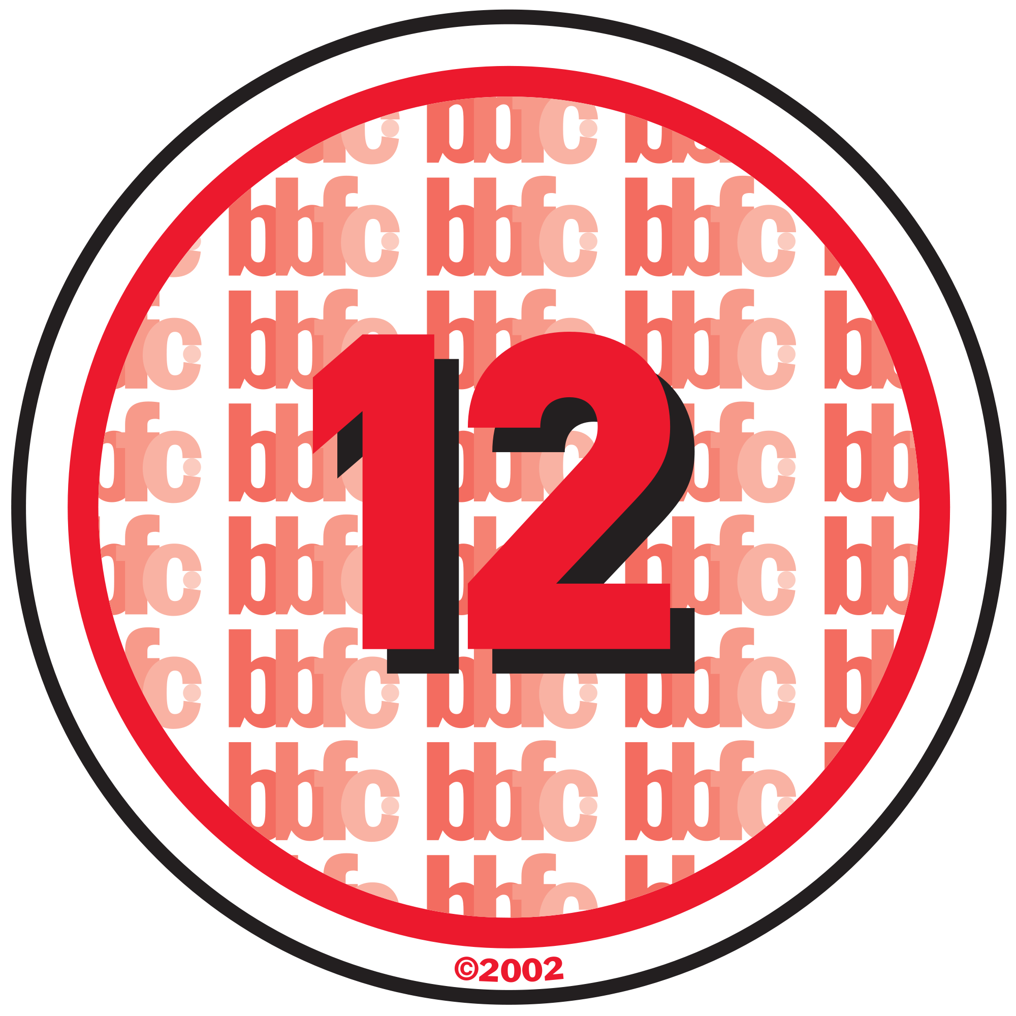
. 'THE CHAIN' RATING
We made the decision to rate this trailer a 15, as is conformed to what we can identify as the conventions of a 15 rated film. With the film being rated 15, this prohibits those under 15 being allowed to legally view it therefore when I did an audience questionnaire, the first age listed was 15 as a way to ensure the audience viewing the trailer was then appropriate and that as the creators of the trailer we stuck to the criteria found of the BBFC website. In our trailer there is a lot of strong violence, which would be unsuitable for those under the age of 15 because they are most likely to be influenced by this. With strong emphasis on blood, there is also use of a knife which shouldn't easily accessible to 12 year old, or glamorised in 12/12A works and this is another reason as to why we rated the film a 15. The trailer dwells strongly on blood and injuries, as the character of 'Lilith is covered in blood and through her interactions with the final girl Riley there are frequent scenes of the blood covered character of Liltih, which could possibly cause some trauma to younger audience members.However because blood and weapons are conventional iconography from this genre they have to included so that the audience can clearly perceive there is an amount of danger but also that it is a Horror film. Due to the '15' criteria some may question if the trailer is accurately rated however because of the lack of dialogue it is open to frequent strong language and drug taking, which would then solidify it's rating. However as the final girl, I would not have been able to partake in any of those hedonistic practices, other characters could have however done such things. Overall the target audience for the film ranged from 15 and above, therefore either a 15 rating or 18 rating could be appropriate however due to the criteria for a 15 rating, our trailer would be accurately rated as a 15.
Sunday, 8 February 2015
. BBFC CLASSIFICATION
The BBFC – what do they do?
In order to protect children from unsuitable and even harmful content in films and videos and to give consumers information they might need about a particular film or video before deciding whether or not to view it, the BBFC examines and age rates films and videos before they are released.
The BBFC look at issues such as discrimination, drugs, horror, dangerous and easily imitable behaviour, language, nudity, sex and violence when making decisions. They also consider context, the tone and likely impact of a work on the potential audience.
(bbf.co.uk)

U – The U symbol stands for universal which means that the context shown is suitable for any child from the age of four years old. Only very mild bad language such as ‘damn’ and ‘hell’ are considered acceptable for this classification. No significant issues can be raised e.g. sex, discrimination, nudity etc, although brief kissing is deemed appropriate. A U film may include brief scenes of violence or moments where a character is in danger but the threat must be quickly resolved and the outcome must be reassuring.

PG – The symbol stands for parental guidance meaning that the film is suitable for general viewing but some scenes may be considered unsuitable for younger children. Mind bad language such as ‘shit’ or ‘bitch’ are considered appropriate but not repeatedly. References to sex are acceptable as long as it is mild and not dwelled upon in detail. Some blood is acceptable as long as the viewers are unable to get an in depth insight on how the wound or injury was inflicted. Realistic or easily accessible weapons such as knives will not be glamorised in a PG classification film.
12/12A – This classification means that anyone aged 12 or over can go and see the film unaccompanied. The A stands for 'accompanied' and 'advisory'. Children younger than 12 may see the film if they are accompanied by an
adult (e.g. someone over the age of 18), who must watch the film with them. Some strong language such as f**** is considered acceptable but it cannot be used frequently. Sex may be portrayed briefly and verbal sex references should not exceed what is appropriate for a young teenager. There may be nudity but again, this must be discreet and brief as well as violence which must also not be dwelled upon. Discriminatory behaviour should not be endorsed in the film as a whole.
 15 – This classification means that the content in the film will only be suitable for a person aged 15 and over. strong violence, frequent strong language (e.g. 'f***'), portrayals of sexual activity, strong verbal, references to sex, sexual nudity, verbal references to sexual violence, discriminatory language or behaviour and drug taking are suitable as long as it is brief and not shown in too much detail.
Friday, 6 February 2015
. ANALYSIS OF PIVOTAL SHOT TYPES

In creating
the horror trailer, I was able to identify the importance of variety of
shot types and angles that are used. These shots and angles are used to
establish the genre of the film and possibly the events that are to follow.
Normally the first image included in a horror trailer is the establishing
shot.
In the
collage you can see there is a shot of a graveyard and this scene was filmed in
the middle of the day. You can see a small figure in all black that appears to
be walking through, that is me. This establishing
shot is used to
portray one of the many settings for this trailer. With the very first scene
being set in a graveyard, there is a level of not only fear but also a level of
consternation as this is an environment that people choose to avoid because of
its link to the supernatural. This was shot using a tripod, in a range of ways
– however we chose to include the scene filmed with the tripod in a stationary
position to provide the audience with a feel of the character being watched.
This scene was inspired by Carrie (1976), as in the ‘graveyard scene’ the
character of Sue Snell approaches Carrie’s grave. Much like the character
Riley who approaches the mystery grave finding ‘the chain’ that our narrative
is centred around.
The second
image is a close up of the necklace on the gravestone,
the image was taken as an over the shoulder shot. In this scene you can see the
necklace on the grave, the necklace denotes the possibility of events of an
evil nature taking place in the very near future because of its connection with
the rave and graveyard. Therefore the range of angles that this scene is filmed
with, provide fear and also alerts the audience that they should track each
movement made by the character in this scene. By highlighting the movements of
the characters protagonist you are able to guess what will happen next and can
also understand their character a little bit further and attempt to conquer the
enigma. The enigma’s in this particular scene are ‘why is she taking the
necklace?’ and ‘who’s is it?'.
The third
image is a wide shot, if you
look closely you can see there is a figure in the background looking in the
direction of the camera/ this is the character Lilith Woods, who is played by
Dawn Gallant. She is awoken by the main protagonist Riley, due to her
relationship with the necklace. We hoped that with this shot the audience would
understand that the necklace actually belonged to Lilith in her past life. The
blood splatter on her dress allows the audience to interpret that she is either
badly injured or a zombie/corpse. With Lilith standing closely to the grave
that Riley found the necklace on, we can see that Riley’s actions (taking the
necklace) mean Lilith is willing to do anything to have it returned to her
final resting place. This is clear as she has come back from the afterlife. We
chose not to zoom in on the grave at this time as we wanted to convince the
audience that the character Lilith was the one who was laid to rest in this
grave. Due to the fact that the grave itself had an inscription on it, the name
of the actual individual we thought it best to not highlight who this person
was. Therefore making the grave an appropriate prop for our narrative due to
the identity of the individual buried to be concealed.
Image four is
an over the shoulder shot, but it’s
done from such an angle that you see both the character of Liltih and Riley.
This is extremely harrowing, as Riley is completely unaware that Lilith is
following her, The use of a wide shot, was important in portraying he
contrast between the very calm surroundings and the disequilibrium introduced
into the scene as Riley’s life is now in danger.
Image five
was taken from a low angle, this type
of angle is normally used to show that this character is powerful and is used
to strike fear in the audience due to them being forced to look up into the
eyes of our villain. She’s at an angle which is slightly threatening hut
still encourages the audience to be inquisitive and wonder what it is she will
do next. With the use of this shot, we can see that Lilith is breaking the third wall. This
technique is used to engage the audience further by showing them they should
not be exempt from feeling a level of fear due the fact that Lilith appears to
be inside the screen. This scene is also set in the graveyard, as this setting
is crucial to the trailers narrative as this is where the narrative begins.
Image six
is also a wide shot, and this
shows Lilith walking over to Riley’s bed. This scene is extremely menacing, as
most would describe their bedrooms as a sanctuary. The safety of this sanctuary
is now being jeopardised due to Lilith invading it. The danger becomes
amplified with the presence of Lilith in Riley's home, Even though Riley has no
idea that Lilith is present in her room, the scene is still frightening as it
supports the audiences fear that ‘just because you can’t see I, doesn't mean
it’s not there.’
Image seven
was a hand I shot that I had the opportunity of directing, this shot was
effective because it showed the audience that there was a level of real danger
that was amplified by this character. The hand held
shot actually
acts as a control for the amount of fear felt because of his character. This is
because our attention is focused at only one place, her eyes. The use of a
strong stare and a slow walk, normally frighten the audience completely. There
is no need for the villain to chase after the victim because they will catch
them eventually e.g this is the case for Halloween, Prom Night and Psycho. The
infamous ‘slow walk scene’ solidifies the fact that the villain refuses to give
up, and seeks complete revenge is very frightening because they don’t have to
run to induce fear into their victim.
Image eight
is one of the most frightening of all the shots in the trailer because, Lilith
is seen here in Riley’s garden. This scene is a mid shot and was filmed late at night, as it
was so dark we had to film with a lamp so we were able to see Lilith’s face.
The use of lighting on her face shows that there is an amount of terror we
should feel because of the way she is superimposed in front of the dark
environment. She becomes the main focus, and therefore we play close attention
to her hair blowing in the wind. The movement of her hair is inspired by ‘The
Ring’, and the use of the setting being at night ensures her shirt stands out,
and the cuts and bruises on her face. We realise exactly how dangerous she is
by the expression on her face which is quite harrowing. We made sure that this
scene lasted for some time because we wanted the audience to feel slightly
uncomfortable as her lack of movement is frightening.
Image nine
is an extreme close
up, from a slightly canted angle. The use of costume make-up in this shot, is very effective as the audience are able to interpret further the type
of character Lilith is, meaning she is to be categorised as an ‘other’.
She’s something to be feared because her eyes connote a sense of insanity.
There is a saying that ‘the eyes are the windows to the soul, with Lilith’s
eyes being so dark we can see she has a very dark and evil nature.
Image ten
is a close up shot. The print
screen of this scene is not as clear as others because of the amount of
movement of the camera. We used a pan for this shot, and you can see the
character of Lilith is looking at the very sharp knife lovingly. She does this
in a very concerning way which is intended to frighten the audience. With
iconography being a convention of the horror genre we chose to include a
weapon. This allows the audience to interpret that this film includes elements
of a Slasher, much like Psycho (1960), although the trailer could also be
categorised as somewhat supernatural.
Image eleven is a medium close up of Riley’s hand, it is possible to see that out
of her palm the necklace dangles. This shot encourages the audience to question
if Riley will/has survived her encounter with Lilith. The use of the necklace
in this scene makes it apparent that the necklace is the cause of all of the
events that are taking place. The significance of us using Riley’s hand also, is she picked up the
necklace with her hands and now it seems that the necklace has resulted in her
near death experience. Throughout the trailer Riley’s weakened through all of
her encounters with Lilith because she does not understand the necklace is
dangerous. This aspect of the narrative is inspired by the Lord of the Rings
trilogy, which also has horror and Gothic qualities.
The twelfth
and final image is a shot of both Riley and Lilith in bed together. Riley is sleeping
peacefully, and Lilith is staring at the camera in a menacing nature. This shot
is frightening, this significance of the use of a high angle shot shows the strong contrast
between the naïve character, Riley and the malicious villain, Lilith. This
moment in the narrative is supposed to frighten the audience more than any
other because of Lilith’s ability to invade Riley’s space so easily without
Riley knowing.