Thursday, 12 February 2015

. FILM MAGAZINE FLAT PLAN

This magazine flat plan illustrates not only the conventions of a poster but also the elements that we will include in our own magazine.
Conventional elements :
Main image
Mast head
Bar code
Plugs
Slogans
Colour scheme
Date
Price
Website
Cover line/tagline
Feature article
Variety of fonts


The colour scheme for our magazine links with the poster as well, as we have chose to use the colours; white, black and red. These are typical colours associated with the horror genre, and connote danger. These colours are stereotypically identified on the traditional vampire, and therefore can closely be linked to the horror genre as vampires have a love for blood and gore and have played an iconic role in the support for the genre itself. Our trailer has elements of a Slasher film which is a sub genre of Horror, because it includes blood and gore as it does involve weapons and there is a focus on blood. This is why we chose to use the colour red on our masthead as it allows the audience to identify that this is a horror magazine.

Empire magazine was our chosen magazine layout , as this magazine sells the largest amount of film magazines in the UK. The magazine doesn't specifically sell magazines of the Horror genre however I have identified they do incorporate horror icons and signature villains from films.
We have placed the magazine mast head at the top of the magazine cover, as this is where it is conventionally placed. The font colours will vary between red, black and white. So that the magazine cover links with the poster, the most important information will be in red.

Bar codes are a convention of the magazine as these are scanned in stores that the magazine will be purchased in. 

The tagline is included on both magazine and poster, as this ensures they are linked. Another way we showed the link between the poster and the magazine was to include the tagline of the film. Because we used the same character on both we decided it would be good way to ensure people could identify the character and that the poster and magazine were linked to ‘The chain’ and it’s new release.

The importance of the colour scheme is a recognisable style, that we will use throughout all of our products. A convention of magazine covers is a medium shot image with a strong stare down the camera lens. So we intend to include an image with these specific elements for our magazine.

Wednesday, 11 February 2015

. EMPIRE/ENTERTAINMENT MAGAZINE COVERS I LIKE

These magazine covers are a few of those featured by ‘Empire’ magazine that I was automatically drawn to due to their use of the horror conventions e.g masks/concealed identities. I chose these magazines, as the characters on the front all play villain’s, Carrie however is an exceptions because she is sometimes labelled as an ‘Anti-hero’. The magazine cover I liked the most was the, Joker edition of ‘Empire magazine’ because it’s the only magazine that uses a long shot, and this shot allows us to see the Joker’s full costume which is extremely interesting. The use of green and purples on the magazine itself correlate closely to his outfits, and the use of these secondary colours attract the audience to not only the character himself but also the actors intentions as normally the colour black is correlated with ‘evil’. The title on this magazine cover is most effective in my opinion because of the superimposition of The Joker over the dulled red ‘Empire’ masthead. The Joker is an extremely important character to the ‘Batman’ franchise, therefore the use of superimposition may be a testament to his effect on the audience.

The most common colours on these magazines are red and white. Red has a range of negative connotations e,g danger, and is the colour of blood. The colour red is closely linked with the horror genre, with blood being a convention also and iconography used in horror films. The Joker edition of Empire magazine lists other films on the cover line, which is a convention horror magazines and an aspect I would like to include also. Elements of horror being included on a cover demonstrate the genre, and allows the audience to also identify the genre.

It is important that he magazine conforms to the main conventions of the genre, this will allow my audience to identify the film as a Horror.

Another favourite cover of mine, is the Carrie edition of Empire magazine. This edition is extremely simple visually, the use of blood on Carrie supports the argument that she is an ‘Anti-hero’ because the negative connotations the colour red has. Red connotes both death and evil, this allows the audience know the character on the front of the cover is evil, and potentially a murderer - an aspect that I would like to include on my own magazine.The use of blood on this character is something I hope to include on the actual character on the front of our magazine. The image however has to link closely to the trailer narrative, and I aim to do this through the use of iconography.

As you can see, the majority of these magazine covers include a range of well known villains, the majority being male characters with concealed identities - this being a convention of the genre tells us the characters on the front page, are in a film with horror-like qualities or they play a character in a horror film. Stereotypically, villains of the horror genre are males however in comparison Carrie is obviously a female and contrasts the ideal of a stereotypical villain. A lot like Carrie, our villain is also female, and covered in blood and scarring. Along with enjoying the film Carrie, I also liked the presentation of her edition of the Empire magazine because it was very simple.

Tuesday, 10 February 2015

. 'THE CHAIN' RATING

We made the decision to rate this trailer a 15, as is conformed to what we can identify as the conventions of a 15 rated film. With the film being rated 15, this prohibits those under 15 being allowed to legally view it therefore when I did an audience questionnaire, the first age listed was 15 as a way to ensure the audience viewing the trailer was then appropriate and that as the creators of the trailer we stuck to the criteria found of the BBFC website. In our trailer there is a lot of strong violence, which would be unsuitable for those under the age of 15 because they are most likely to be influenced by this. With strong emphasis on blood, there is also use of a knife which shouldn't easily accessible to 12 year old, or glamorised in 12/12A works and this is another reason as to why we rated the film a 15. The trailer dwells strongly on blood and injuries, as the character of 'Lilith is covered in blood and through her interactions with the final girl Riley there are frequent scenes of the blood covered character of Liltih, which could possibly cause some trauma to younger audience members.However because blood and weapons are conventional iconography from this genre they have to included so that the audience can clearly perceive there is an amount of danger but also that it is a Horror film. Due to the '15' criteria some may question if the trailer is accurately rated however because of the lack of dialogue it is open to frequent strong language and drug taking, which would then solidify it's rating. However as the final girl, I would not have been able to partake in any of those hedonistic practices, other characters could have however done such things. Overall the target audience for the film ranged from 15 and above, therefore either a 15 rating or 18 rating could be appropriate however due to the criteria for a 15 rating, our trailer would be accurately rated as a 15.

Sunday, 8 February 2015

. BBFC CLASSIFICATION

The BBFC – what do they do?
In order to protect children from unsuitable and even harmful content in films and videos and to give consumers information they might need about a particular film or video before deciding whether or not to view it, the BBFC examines and age rates films and videos before they are released.

The BBFC look at issues such as discrimination, drugs, horror, dangerous and easily imitable behaviour, language, nudity, sex and violence when making decisions. They also consider context, the tone and likely impact of a work on the potential audience. 
                                                             (bbf.co.uk)


U – The U symbol stands for universal which means that the context shown is suitable for any child from the age of four years old.  Only very mild bad language such as ‘damn’ and ‘hell’ are considered acceptable for this classification. No significant issues can be raised e.g. sex, discrimination, nudity etc, although brief kissing is deemed appropriate. A U film may include brief scenes of violence or moments where a character is in danger but the threat must be quickly resolved and the outcome must be reassuring.

PG
– The symbol stands for parental guidance meaning that the film is suitable for general viewing but some scenes may be considered unsuitable for younger children. Mind bad language such as ‘shit’ or ‘bitch’ are considered appropriate but not repeatedly. References to sex are acceptable as long as it is mild and not dwelled upon in detail. Some blood is acceptable as long as the viewers are unable to get an in depth insight on how the wound or injury was inflicted. Realistic or easily accessible weapons such as knives will not be glamorised in a PG classification film.


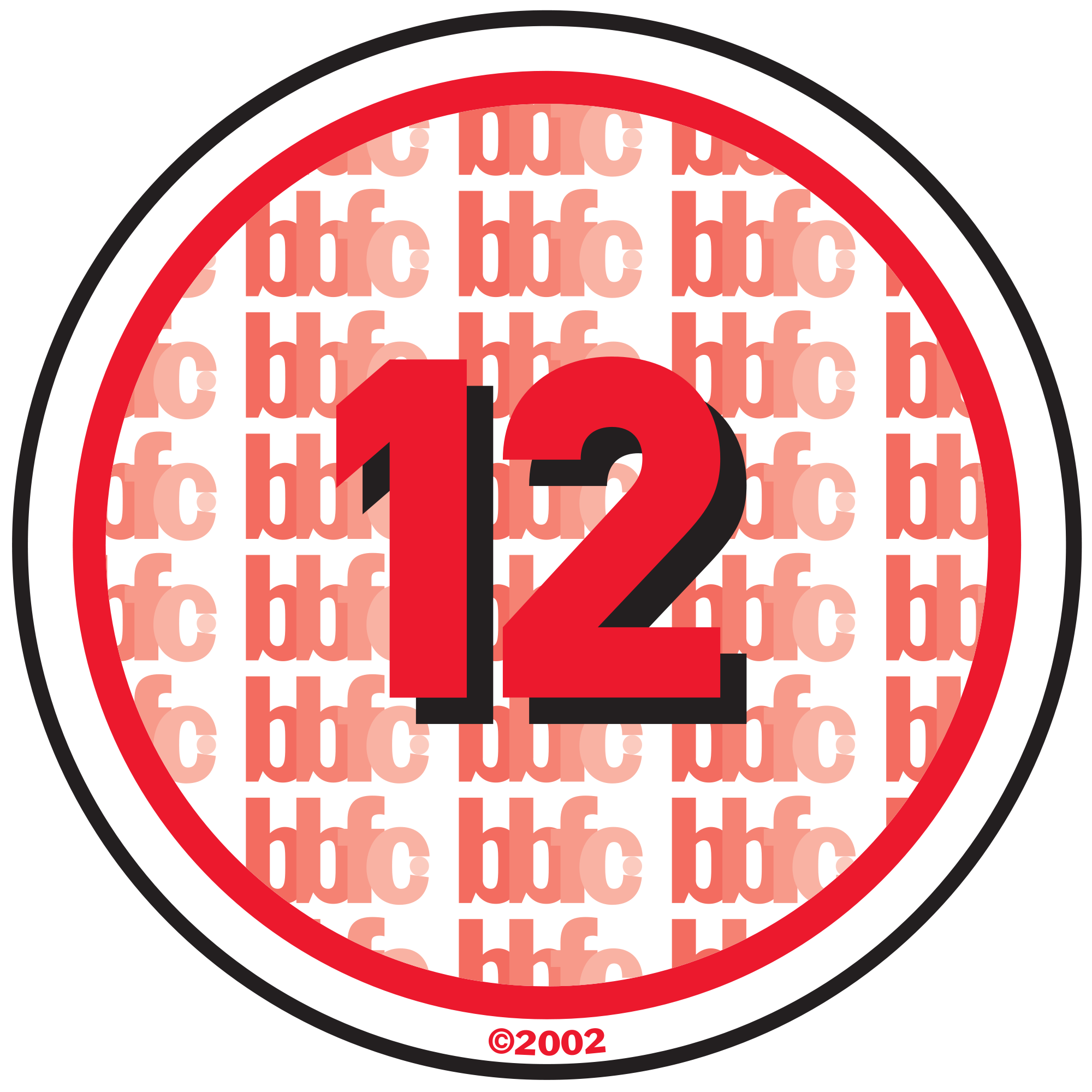
12/12A – This classification means that anyone aged 12 or over can go and see the film unaccompanied. The A stands for 'accompanied' and 'advisory'. Children younger than 12 may see the film if they are accompanied by an 
adult (e.g. someone over the age of 18), who must watch the film with them. Some strong language such as f**** is considered acceptable but it cannot be used frequently.  Sex may be portrayed briefly and verbal sex references should not exceed what is appropriate for a young teenager. There may be nudity but again, this must be discreet and brief as well as violence which must also not be dwelled upon.  Discriminatory behaviour should not be endorsed in the film as a whole.

15 – This classification means that the content in the film will only be suitable for a person aged 15 and over. strong violence, frequent strong language (e.g. 'f***'), portrayals of sexual activity, strong verbal, references to sex, sexual nudity, verbal references to sexual violence, discriminatory language or behaviour and drug taking are suitable as long as it is brief and not shown in too much detail.


18 This classification means that content is only suitable for adults. No theme is prohibited at 18 as adults are allowed to pick their own entertainment within the law, which means that some themes may be deemed effective

Friday, 6 February 2015

. ANALYSIS OF PIVOTAL SHOT TYPES

In creating the horror trailer, I was able to identify the importance of variety of shot types and angles that are used. These shots and angles are used to establish the genre of the film and possibly the events that are to follow. Normally the first image included in a horror trailer is the establishing shot. 
In the collage you can see there is a shot of a graveyard and this scene was filmed in the middle of the day. You can see a small figure in all black that appears to be walking through, that is me.  This establishing shot is used to portray one of the many settings for this trailer. With the very first scene being set in a graveyard, there is a level of not only fear but also a level of consternation as this is an environment that people choose to avoid because of its link to the supernatural. This was shot using a tripod, in a range of ways – however we chose to include the scene filmed with the tripod in a stationary position to provide the audience with a feel of the character being watched. This scene was inspired by Carrie (1976), as in the ‘graveyard scene’ the character of Sue Snell approaches Carrie’s grave. Much like the character Riley who approaches the mystery grave finding ‘the chain’ that our narrative is centred around.

The second image is a close up of the necklace on the gravestone, the image was taken as an over the shoulder shot. In this scene you can see the necklace on the grave, the necklace denotes the possibility of events of an evil nature taking place in the very near future because of its connection with the rave and graveyard. Therefore the range of angles that this scene is filmed with, provide fear and also alerts the audience that they should track each movement made by the character in this scene. By highlighting the movements of the characters protagonist you are able to guess what will happen next and can also understand their character a little bit further and attempt to conquer the enigma. The enigma’s in this particular scene are ‘why is she taking the necklace?’ and ‘who’s is it?'.

The third image is a wide shot, if you look closely you can see there is a figure in the background looking in the direction of the camera/ this is the character Lilith Woods, who is played by Dawn Gallant. She is awoken by the main protagonist Riley, due to her relationship with the necklace. We hoped that with this shot the audience would understand that the necklace actually belonged to Lilith in her past life. The blood splatter on her dress allows the audience to interpret that she is either badly injured or a zombie/corpse. With Lilith standing closely to the grave that Riley found the necklace on, we can see that Riley’s actions (taking the necklace) mean Lilith is willing to do anything to have it returned to her final resting place. This is clear as she has come back from the afterlife. We chose not to zoom in on the grave at this time as we wanted to convince the audience that the character Lilith was the one who was laid to rest in this grave. Due to the fact that the grave itself had an inscription on it, the name of the actual individual we thought it best to not highlight who this person was. Therefore making the grave an appropriate prop for our narrative due to the identity of the individual buried to be concealed.

Image four is an over the shoulder shot, but it’s done from such an angle that you see both the character of Liltih and Riley. This is extremely harrowing, as Riley is completely unaware that Lilith is following her, The use of a wide shot, was important in portraying he contrast between the very calm surroundings and the disequilibrium introduced into the scene as Riley’s life is now in danger.

Image five was taken from a low angle, this type of angle is normally used to show that this character is powerful and is used to strike fear in the audience due to them being forced to look up into the eyes of our villain.  She’s at an angle which is slightly threatening hut still encourages the audience to be inquisitive and wonder what it is she will do next. With the use of this shot, we can see that Lilith is breaking the third wall. This technique is used to engage the audience further by showing them they should not be exempt from feeling a level of fear due the fact that Lilith appears to be inside the screen. This scene is also set in the graveyard, as this setting is crucial to the trailers narrative as this is where the narrative begins.

Image six is also a wide shot, and this shows Lilith walking over to Riley’s bed. This scene is extremely menacing, as most would describe their bedrooms as a sanctuary. The safety of this sanctuary is now being jeopardised due to Lilith invading it. The danger becomes amplified with the presence of Lilith in Riley's home, Even though Riley has no idea that Lilith is present in her room, the scene is still frightening as it supports the audiences fear that ‘just because you can’t see I, doesn't mean it’s not there.’

Image seven was a hand I shot that I had the opportunity of directing, this shot was effective because it showed the audience that there was a level of real danger that was amplified by this character. The hand held shot actually acts as a control for the amount of fear felt because of his character. This is because our attention is focused at only one place, her eyes. The use of a strong stare and a slow walk, normally frighten the audience completely. There is no need for the villain to chase after the victim because they will catch them eventually e.g this is the case for Halloween, Prom Night and Psycho. The infamous ‘slow walk scene’ solidifies the fact that the villain refuses to give up, and seeks complete revenge is very frightening because they don’t have to run to induce fear into their victim.

Image eight is one of the most frightening of all the shots in the trailer because, Lilith is seen here in Riley’s garden. This scene is a mid shot and was filmed late at night, as it was so dark we had to film with a lamp so we were able to see Lilith’s face. The use of lighting on her face shows that there is an amount of terror we should feel because of the way she is superimposed in front of the dark environment. She becomes the main focus, and therefore we play close attention to her hair blowing in the wind. The movement of her hair is inspired by ‘The Ring’, and the use of the setting being at night ensures her shirt stands out, and the cuts and bruises on her face. We realise exactly how dangerous she is by the expression on her face which is quite harrowing. We made sure that this scene lasted for some time because we wanted the audience to feel slightly uncomfortable as her lack of movement is frightening.

Image nine is an extreme close up, from a slightly canted angle. The use of costume make-up in this shot, is very effective as the audience are able to interpret further the type of character Lilith is, meaning she is to be categorised as an ‘other’. She’s something to be feared because her eyes connote a sense of insanity. There is a saying that ‘the eyes are the windows to the soul, with Lilith’s eyes being so dark we can see she has a very dark and evil nature.

Image ten is a close up shot. The print screen of this scene is not as clear as others because of the amount of movement of the camera. We used a pan for this shot, and you can see the character of Lilith is looking at the very sharp knife lovingly. She does this in a very concerning way which is intended to frighten the audience. With iconography being a convention of the horror genre we chose to include a weapon. This allows the audience to interpret that this film includes elements of a Slasher, much like Psycho (1960), although the trailer could also be categorised as somewhat supernatural. 

Image eleven is a medium close up of Riley’s hand, it is possible to see that out of her palm the necklace dangles. This shot encourages the audience to question if Riley will/has survived her encounter with Lilith. The use of the necklace in this scene makes it apparent that the necklace is the cause of all of the events that are taking place. The significance of us using Riley’s hand also, is she picked up the necklace with her hands and now it seems that the necklace has resulted in her near death experience. Throughout the trailer Riley’s weakened through all of her encounters with Lilith because she does not understand the necklace is dangerous. This aspect of the narrative is inspired by the Lord of the Rings trilogy, which also has horror and Gothic qualities.

The twelfth and final image is a shot of both Riley and Lilith in bed together. Riley is sleeping peacefully, and Lilith is staring at the camera in a menacing nature. This shot is frightening, this significance of the use of a high angle shot shows the strong contrast between the naïve character, Riley and the malicious villain, Lilith. This moment in the narrative is supposed to frighten the audience more than any other because of Lilith’s ability to invade Riley’s space so easily without Riley knowing.

Thursday, 5 February 2015

. SHOTS TAKEN

These are the print screens of a range of scenes shot over the process of making this horror trailer. As you can see from the thumbnail, there are a range of shots taken from different angles and in different settings. The variety of scenes filmed allowed us as a group to really decide what moments were to be included in the narrative. I star in a large amount of scenes as I played the role of the final girl, and as a group we chose what scenes were the most appropriate for the narrative. The benefits of going through scenes as a group allowed us to all take part in the decision making process of what went into the trailer, this allowed us to genuinely be happy with the end product. If there happened to be a scene that we did not all agree on, we simply did not include it and due to the fact that we had a large amount of scenes to choose from this was not detrimental to the progression of the trailer. As you can see from the thumbnails a good majority of the scenes were filmed in the daylight, as because of the season it got darker earlier and without being able to rely on natural lighting the shot would not have been appropriate. Therefore with the use of the editing software Adobe Premiere 6 we darkened pivotal scenes e.g the scene where Riley walks through the graveyard, the altered brightness and contrast on the scene encouraged the audience to feel a level of distress.


Monday, 2 February 2015

. CHOSEN FILM PRODUCTION COMPANY


Lionsgate Films (formerly known as Cinépix Film Properties) is a Canadian-Americanfilm production/distribution studio and a division of Lions Gate Entertainment. It is the largest and most successful mini-major film studio in North America. It focuses on foreign and independent films and has distributed various commercially successful film series, including The Twilight Saga (partially), The Hunger GamesThe Divergent SeriesSaw and The Expendables.

Lions Gate Entertainment Corporation (LGE) was formed in the summer of 1997 by Frank Giustra, a banker who had experience in feature film financing.